How to Build A React TS Tailwind Design System
Why you would want to do it and a step-by-step guide on how.

What is this❓ Another "how to" article (post)?!
Yes, it is.
What's in it for you?
Hear me out, it's going to be worth it.
By the end of this post, you will be able to roll out a starting point for your own React + TypeScript + Tailwind + Styled Components design component library. Also, you will learn how to craft a workflow using powerful tools like StoryBook, Chromatic, and TSDX. Besides that, we will see and learn a bit about setting up stuff like React Testing Library and how to fix some of those annoying TS errors we encounter.
Moreover, I will attempt to explain why and how I went down this same road, presumably, in an entertaining and informing way 🤓.
If you want to skip ahead to the "How to" section click here, or if you want to go straight ahead to the final code, check out the repository here.
Table Of Contents:
- The Background
- How To
- Suffix
A Cautionary Start
This whole post started with this tweet:
Seeing as it got some attention, I was bound by Twitter law to strap in, knuckle down and start typing.
For me, a lot of things around how I learn are a part necessity, part interest, and always a journey. It is important to understand the journey to realize if you have gotten to your destination.
So, here I am again, at a new place with new challenges ahead of me... I have written some stories about my humble beginnings, as well as some tales of other challenges I've faced as an engineer.
This time it started at a new company I joined not too long ago. About a month in, I was tasked with implementing a white labeling solution for one of the products to a client. For the sake of this post, what the company does is not that important. I was lead down this path because there are about 5 different applications and more in thoughts and planning. Being in the startup world, that's just the way it goes.
Like I was saying, I started working on white labeling one of the products, not knowing much about what was at my disposal in terms of assets, eg. shared packages, component libraries, etc. I cracked my knuckles and started browsing through the different organizations Github Repos and started talking to people, trying to understand what is there that I can use to achieve the task at hand.
I ended up finding 3 different "common" React component libraries that weren't used across all the applications, but some... It was divergent... Being a so to speak early-age startup, a lot of the code in the repositories was (and still is) "gung hoed". This is not saying anything critical about other engineers, I've been there, done that...
All of the front-end apps are built with React and adopted Styled Components at some point. Some had also SaSS mixed in, some had TypeScript, and some Flow.
I had to start working on my task, so I did just that, hoping I could find my way through while learning about why the situation is as it is and how we could improve. To get my task done, I looked into leveraging Styled Components theming functionality. But what I found out was that there were parts of the theme being passed from the app and some getting overridden by one of the shared packages.
I also set out to Twitter to gauge my approach:
In the end, I ended up with a solution I also shared:
It was clear to me that this is an ok solution for now, but this has raised the need to think about what we would need to do if some other client would want a white label of its' own.
After discussing all the fun I had with the rest of my team and our former discussions around our shared packages, I was aware that there were processes that have started regarding building a design system, but were nipped in the bud for various reasons. I thought it was a good time to get this process going again and my colleagues and engineering leadership (luckily 😅) agreed as well.
The Problem
- Scattered components across repositories and applications.
- Different teams working on several products.
- No way for developers to know what they can use.
- Designers repeating design or re-designing components that already exist.
- Product has no visibility as to what is available for new features.
What we aim to solve was reducing the number of components that are being written across the organization, share code, and be able to see what we have, while having a single repository to develop where we can manage versioning and distribution.
The solution is inevitable - we need a design system.
What is a design system?
There is a lot of material out there about the correct definition of this term, as well as different opinions around, and I've read half a dozen posts and explanations what it is. It seems to be something else for different people in relation to their occupation.
For developers, this could be a shared component library (or package) like Material-UI, ChakraUI, BaseUI, etc. But, for designers, it could be a sketch file that has all the designs in one place. I've even heard product people call it a UI-Toolkit.
I think the general definition I liked the most is by Audrey Hacq as stated in her post "Everything you need to know about design systems":
"A Design System is the single source of truth which groups all the elements that will allow the teams to design, realize and develop a product."
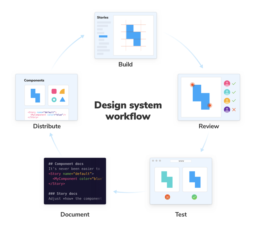
Design systems are all the rage nowadays. They are key for product design consistency, better stakeholder communication, and allow rapid development of new applications. Like it or don't they are a curse and a blessing. They help with cross alignment, but they are hard to create, adopt and maintain correctly.
 https://www.learnstorybook.com/design-systems-for-developers/react/en/introduction/
To the Drawing Board
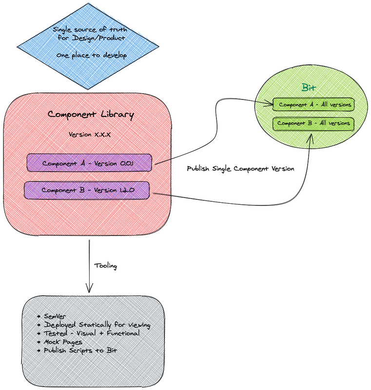
Something I neglected to mention earlier is that one of the shared libraries we had was using Bit and we had a collection of Bit components, which were used sparingly across applications. If you are not familiar with it, the gist is that you can build, version, and distribute components individually through their cloud. A really powerful concept of super modularity. The promises on their webpage get you excited about building something truly composable.
That's why for the first iteration I came up with this diagram:
This appeared to be a sound plan. However, things don't always go according to our plans...
The short version is it was not worth it for our use case, in my humble opinion. Even so, I've read an article published on Bit's blog "Bit's and Pieces", conveniently titled "How we Build a Design System" which had me truly optimistic at first. Nevertheless, those shiny marketing messages on the Bit homepage fail to fulfill this utopian world of component composition.
The whole process I went through with this piece of tech is worth a blog post of its own (I've even already written down the title in my notes: "The Bit they don't tell you about Bit" 😅).
After meticulously crafting a whole workflow based on every shred of documentation and examples I could find, it didn't sit right. Specifically, around the workflow, I imagined increasing the collaboration and velocity of my team and with Bit, there seemed to be too much overhead for any new coming developer to the project.
The bottom line was, Bit doesn't play nice with Git. In my opinion, having a streamlined process that involves Git, code reviews, and design reviews are crucial.
Having said that, I have nothing bad to say about Bit. I think it has incredible potential, but it still is not fully there, it does not live up to the promise. I will keep a close eye on them though, they might just surprise us just yet.
(A few weeks after writing the above lines, I am happy to say that with the help and perseverance of my good friend and teammate Yonatan Katz, we were able to achieve our desired workflow with Bit. Having a single repo for the entire design system, while publishing each component individually to the Bit cloud 😃 . Seeing as changing these paragraphs will break the narrative of the story, I'm choosing to keep things as they are with this small note to share the happy ending of that challenge and thoughts.)
As for myself, I needed a new plan...

A Tale of Wind
I'm a dev news junkie and a hype-driven development practitioner (😜 ). As such, I could not stop hearing about TailwindCSS. Every second article or tweet I read mentioned how good Tailwind is. Furthermore, every third podcast I listened to had either Adam Wathan on it or someone mentioning him.
This tweet by Nader Dabit showcases what I went through:
The one piece that stuck with me the most was by Max Stoiber titled "Why I Love Tailwind". In it, he makes a great case about the key feature of Tailwind being that the core of the framework is its design tokens:
"The key to Tailwind's popularity is the painstakingly constructed system of design tokens at the core of the framework."
Max goes further on about the downsides he sees and suggests a way to use it without them. The answer - twin.macro.
The gist of it is that it is a Babel macro that runs at build time and creates Tailwinds' critical CSS styles that are necessary for any given page as well as being extendable using CSS in JS libraries such as Styled Components or Emotion.
Once again, this seemed a solid plan.
Some people don't feel the love for Tailwind, and of course, have some valid points. You can read "Why Tailwind Isn't for Me" by Jared White from a different point of view.
Enter TSDX

Once I decided to ditch Bit, to get the ball rolling on this project I needed a way to build a pattern library, or more simply put a package.
Being as JavaScript is dead and TypeScript is the successor (I kid of course! 😉), I wanted to find a way to easily start a repo without fidgeting around with configs too much. That is when I found Jared Plamer's project TSDX.
For those of you not familiar with Jared, he is behind projects like formik and razzle. Also, he has been heard to be seen sparingly next to a mad beat maker, wearing a neck chain and boxer shorts with an American bald eagle (shout out Kenny! ✊🏽), while talking into a mic on the Undefined Podcast.
The project's tagline sums it all up beautifully:
"TSDX is a zero-config CLI that helps you develop, test, and publish modern TypeScript packages with ease--so you can focus on your awesome new library and not waste another afternoon on the configuration."
It also comes with templates built-in, one of them was specifically what I was looking for react-with-storybook.
One article that helped me find my feet with TSDX was "Build your First Typescript Package in Under 10 Minutes" by Gabriel Abud.
In short, it does exactly what it promises with a really low learning curve. Furthermore, something really neat that comes in the mix is the example directory, which is just a playground React App to test your code. Unlike TSDX, which uses Rollup bundler, it uses Parcel to get it running (not super important, I just find it interesting). You can import the bundled package code into there to battle-test it.
One thing that is good to mention though, is that TSDX comes with preconfigured Github Actions that test and build your package. Something that I didn't know about it and misunderstood was all the matrix testing in .github/workflow/main.yml which has a node matrix configuration that spins up different types of operating systems to test the package on.
Be wary that the Github Action minute calculation for OSs is different. This could lead to spending your budget or free minute allocation pretty quickly. Learn from my experience. I had to learn the hard way and eventually migrated all actions to CircleCI. 😳
Getting UI Feedback with Chromatic
One other tool I like and recommend using with Storybook is Chromatic. I came across it while reading Storybooks' article "Design Systems for Developers". It helps you better manage the whole workflow of your component library. You can get feedback from your teammates easily, it helps with visual testing (and makes snapshot testing almost redundant, IMO), It becomes part of your PR process, and publishes your Storybook to the cloud. Besides that, it is pretty simple to set up (I'll get to that later).
Bringing It All Together
Alright, I had my tools in place and it was time to start connecting the dots, so to speak. I kicked off a new TSDX project, installed Styled components, and then went on to try and set up twin.macro. However, I hit a snag there... In the Twin example repo, there was no Styled Components + Storybook example, so I configured what seemed to make sense. Then I went on to add some samples, imported them into a new Story, and tried to run Storybook. It didn't work as expected. Some of the code worked and other components that were using the tw syntax didn't:
import React from 'react';
import 'twin.macro';

export const Logo = () => (
  <a
    // Use the tw prop to add tailwind styles directly on jsx elements
    tw='w-32 mb-10 p-5 block opacity-50 hover:opacity-100'
    href='https://github.com/ben-rogerson/twin.macro'
    target='_blank'
    rel='noopener noreferrer'
  >
    <TwinSvg />
  </a>
);

const TwinSvg = () => (
  <svg fill='black' viewBox='0 0 100 35' xmlns='http://www.w3.org/2000/svg'>
    <path d='m31.839 11.667c0-6.2223-3.3515-10.111-10.054-11.667 3.3514 2.3333 4.6082 5.0556 3.7704 8.1667-0.4781 1.7751-1.8653 3.0438-3.4009 4.4481-2.5016 2.2877-5.3968 4.9354-5.3968 10.718 0 6.2223 3.3515 10.111 10.054 11.667-3.3515-2.3333-4.6083-5.0556-3.7704-8.1667 0.478-1.775 1.8653-3.0438 3.4009-4.4481 2.5015-2.2877 5.3967-4.9354 5.3967-10.718z' />
    <path d='m-2.7803e-7 11.667c1.4828e-7 -6.2223 3.3515-10.111 10.055-11.667-3.3515 2.3333-4.6083 5.0556-3.7705 8.1667 0.47806 1.7751 1.8653 3.0438 3.4009 4.4481 2.5016 2.2877 5.3968 4.9354 5.3968 10.718 0 6.2223-3.3515 10.111-10.054 11.667 3.3515-2.3333 4.6083-5.0556 3.7704-8.1667-0.47805-1.775-1.8653-3.0438-3.4009-4.4481-2.5015-2.2877-5.3967-4.9354-5.3967-10.718z' />
    <path d='m50.594 15.872h-3.9481v7.6c0 2.0267 1.3373 1.995 3.9481 1.8683v3.0717c-5.2853 0.6333-7.3867-0.8233-7.3867-4.94v-7.6h-2.9292v-3.2933h2.9292v-4.2534l3.4386-1.0133v5.2667h3.9481v3.2933zm21.324-3.2933h3.6297l-4.9988 15.833h-3.3749l-3.3113-10.672-3.3431 10.672h-3.375l-4.9987-15.833h3.6297l3.0884 10.925 3.3431-10.925h3.2794l3.3113 10.925 3.1202-10.925zm7.8961-2.375c-1.2099 0-2.1969-1.0134-2.1969-2.185 0-1.2033 0.987-2.185 2.1969-2.185s2.1969 0.98167 2.1969 2.185c0 1.1717-0.987 2.185-2.1969 2.185zm-1.7193 18.208v-15.833h3.4386v15.833h-3.4386zm15.792-16.245c3.566 0 6.1131 2.4067 6.1131 6.5233v9.7217h-3.4386v-9.3733c0-2.4067-1.401-3.6734-3.566-3.6734-2.2606 0-4.0436 1.33-4.0436 4.56v8.4867h-3.4386v-15.833h3.4386v2.0266c1.0507-1.6466 2.77-2.4383 4.9351-2.4383z' />
  </svg>
);
After that, I tried pulling the output code into our helpful example repo, and that seemed to work.
I went on fiddling and trying stuff, and even reached out to Ben Rogerson the creator:
He did help me understand how to add some Tailwind intellisense for Twin:
But I have still not been able to get the above syntax to work in my library. I set it aside and moved on, as I had plans and willingness in my company to start developing the library. However, I am keen to get back to it at some point.
You can check out the TSDX-Twin repo here that has 1 out of 3 components working.
What I ended up doing was starting a repo from scratch and just going with Styled Components + Tailwind vanilla.
I could go on about the process of selling this whole idea back to my team and mention all the discussions around this project... But that's probably not why you're here 😉 ...
OK, story time is over. Let's get down to the brass tax!
Setting up TSDX
For the sake of this post, I will start up a new repo and take it one step at a time as I write this. I will commit every step, so you can follow along or just check out the commits.
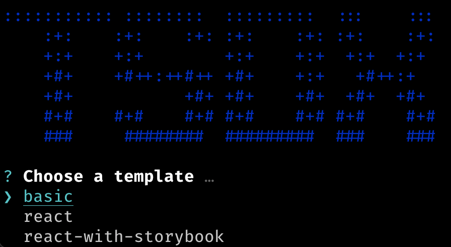
Let's start by bootstrapping a new TSDX project:
// In your terminal / command line run:

npx tsdx create new-project-name
- This will install all the initial packages and create a
new-project-namefolder. - After that step is done, you will be prompted to choose a template:
- Choose
react-with-storybook. - Necessary NPM modules will be installed.
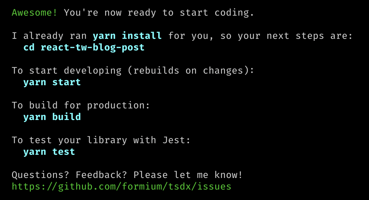
- Once it finishes you will get this confirmation:
- Now we can
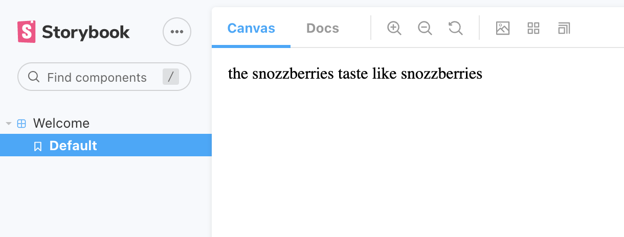
cdinto the directory and runyarn startto start developing in watch mode, but as we are working on a React component library and want to practice Storybook driven development (SDD) we can just runyarn storybookand be on our way. - Spinning up Storybook on a fresh TSDX project will yield the amazing "snozzberies" component:
Not much to write home about, but a good start.
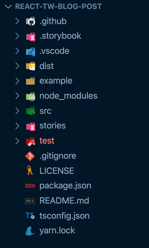
If we open up our project in our editor this is the folder structure we should see:
Let's breakdown the folders and files:
.github: Generated Github actions (If you are unfamiliar with them, I do encourage you to read about them here), their purpose is to automate your workflows and achieve CI (continuous integration). Under this folder we have 2 files:main.yml: Instructions for the GitHub action on how to install dependencies, lint>) your code, run tests, and build the package. It runs on a different node version matrix, and different operating systems (important to know this as I've mentioned earlier).size.yml: This little nugget is here to help you keep track of the size of the package using, the configuration set inpackage.jsonunder the"size-limit"property. It is set to 10KB as the default, on the generated output files. You can change it if the need arises. This action runs when you push the code to a Github repository and will fail your checks if you pass the limit.
.storybook: this is where your Storybook configuration lives. You can read more about it in their Setup section..vscode: This folder is only generated if you use VScode. As I used it in this project, it was created and has my workbench settings. I've also added recommended extensions, which you can try and use if you decide to clone this repo.dist: The bundled output of our library code. This is what will essentially be used by consumers of this package. It holds the minifiedesm(ES modules) andcjs(Common JS) files, as well as source maps andTypeScripttype definitions.example: Includes our playground React App, which I've mentioned above. This will not be part of the bundle, and will not be published to whatever package manager you choose to use.node_modules: Where all JavaScript installed package modules live.src: Here is where the actual magic is. This is the main source file and code that will be compiled out to ourdistfolder. Inside of this directory is theindex.tsxfile, which is where you want to import all other source files you create. On a newly created TSDX project, you get the code for the aforementioned "snozzberies" component.stories: Where your Storybook stories live. This is where we want to put the code that we write to display our UI to us. "Snozzberries" component is imported and rendered here.test: In this directory, we will write our tests. When we first open it, a test for the generated component is there underblah.test.tsx.
Other than those folders we also have the regular generic files like:
package.json- which shows our dependency list.gitignore- ignored files fromgit.LICENSE- Automatically generated MIT license, change as you wish.README.md- Generated by TSDX, this file has more information about how to use the tool. If you plan on publishing this project as a package, I encourage you to change this and write down clear instructions on how to install and use your library.tsconfig.json: The TypeScript configuration file that was generated by TSDX. It comes preconfigured in an opinionated way by the maintainers. I suggest leaving it as it is unless you know what you're doing or want something specifically different.
Installing Tailwind
⚠️ Remember: Tailwind CSS requires Node.js 12.13.0 or higher.
To get Tailwind into the mix, you can follow along with their installation docs (this section will be kind of similar to that, but I think it's helpful to have in this post for ease of use). As I've already done this (several times 😅 ), for TSDX and Storybook compatibility we will need to use the PostCSS 7 compatibility build.
If you are unfamiliar with PostCSS, in short, it's a tool for transforming CSS with JavaScript and allows us to use "Tomorrow's CSS today". It is a CSS preprocessor, similar to SaSS, but with some differences.
Let's install our dependencies by running:
yarn add -D tailwindcss@npm:@tailwindcss/postcss7-compat @tailwindcss/postcss7-compat postcss@^7 autoprefixer@^9

# alternatively: run with npm install -D ...
Notice I am installing everything as a dev dependency, as this is a package, we want to keep dependencies to a minimum and allow our tools to do their job. For some things, we might want to update our
package.json"peerDependencies".
Next, we will need to add a postcss config in the root of our project:
// postcss.config.js

module.exports = {
  plugins: {
    tailwindcss: {},
    autoprefixer: {},
  },
};
Now we can initialize Tailwind with:
npx tailwindcss init
That will create a tailwind.config.js file in the root as well, where you can add and customize your configuration as needed:
// tailwind.config.js

module.exports = {
  purge: [],
  darkMode: false, // or 'media' or 'class'
  theme: {
    extend: {},
  },
  variants: {},
  plugins: [],
};
Next up, we need to include Tailwind in our CSS, in our case, there are 2 things we need:
- To be able to import our CSS into components, we will need to tell TSDX how to include it with our code. For that, we will need to install
rollup-plugin-postcss(as TSDX uses rollup). - Create a
CSSfile in oursrcdirectory which we will use in any component in which we want to use Tailwind.
Alright, so now let's add rollup-plugin-postcss:
yarn add -D rollup-plugin-postcss
TSDX is fully customizable and you can add any
rollupplugin, but be aware that it overrides the default behavior
Now we'll create a tsdx.config.js file in the root and in it, we'll put the following code:
// tsdx.config.js

const postcss = require('rollup-plugin-postcss');

module.exports = {
  rollup(config, options) {
    config.plugins.push(
      postcss({
        config: {
          path: './postcss.config.js',
        },
        extensions: ['.css'],
        minimize: true,
        inject: {
          insertAt: 'top',
        },
      })
    );
    return config;
  },
};
This is giving our postCSS path, which tells it what files we want it to run on. The minimize key is to allow us to minimize the output. The most important key here is the "inject". We set it to "top" to tell postCSS where inside the <head> of our page the CSS will be inserted. It's paramount for Tailwind as it needs to have the utmost priority of any other stylesheet.
Next, for part 2, we will create a tailwind.css (can be named anything else) file under the src directory and paste this in:
// src/tailwind.css

@tailwind base;
@tailwind components;
@tailwind utilities;
Great! This should allow us to get the job done.
Let's check it out on the only component we currently have and see if it works:
// src/index.tsx

import React, { FC, HTMLAttributes, ReactChild } from 'react';

// ! Add the CSS import statement !
import './tailwind.css`;

// ...

// we'll add some Tailwind classes on our components to test

export const Thing: FC<Props> = ({ children }) => {
  return (
    <div className="flex items-center justify-center w-5/6 m-auto text-2xl text-center text-pink-700 uppercase bg-blue-300 shadow-xl rounded-3xl">
      {children || `the snozzberries taste like snozzberries`}
    </div>
  );
};
Now we'll run our StoryBook (yarn storybook) and have a look:
That's a nice-looking "snozzberries" component!
At this point, it would be a good time to sort and prepare our package a bit so we can have more than 1 component. For that, we'll change the name of the file that holds our beloved "snozzberries" component from index.tsx to Thing.tsx. Then, we'll create a new index.tsx file where we'll export all of our components and let TSDX do its thing:
// index.tsx:

export * from './Thing';

// We use the "*" export to get everything out of our file: components and types.
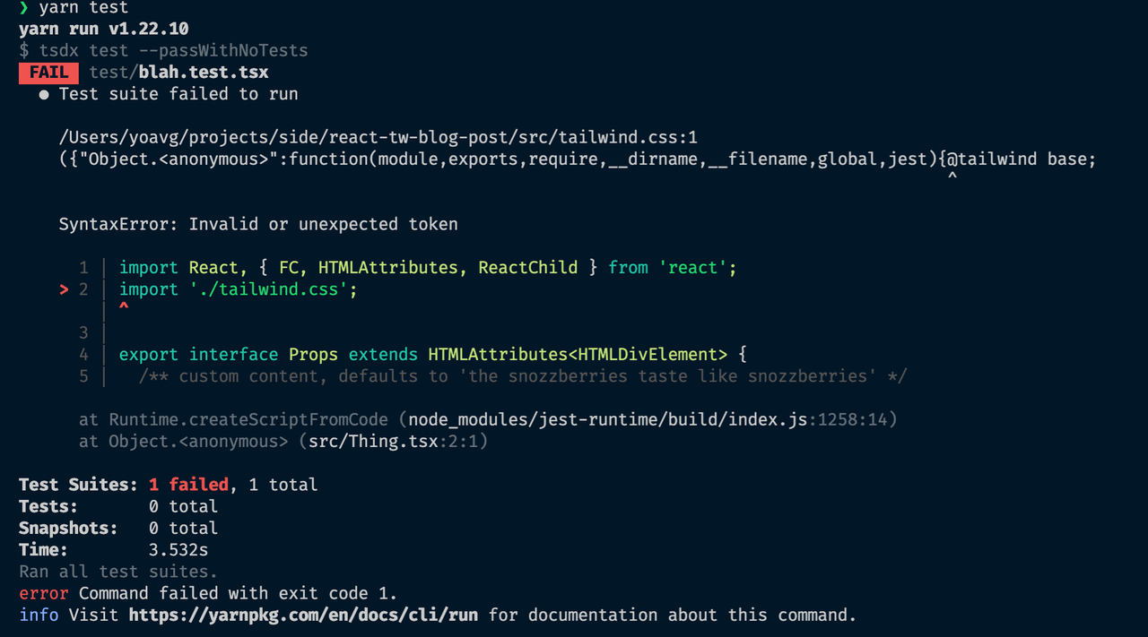
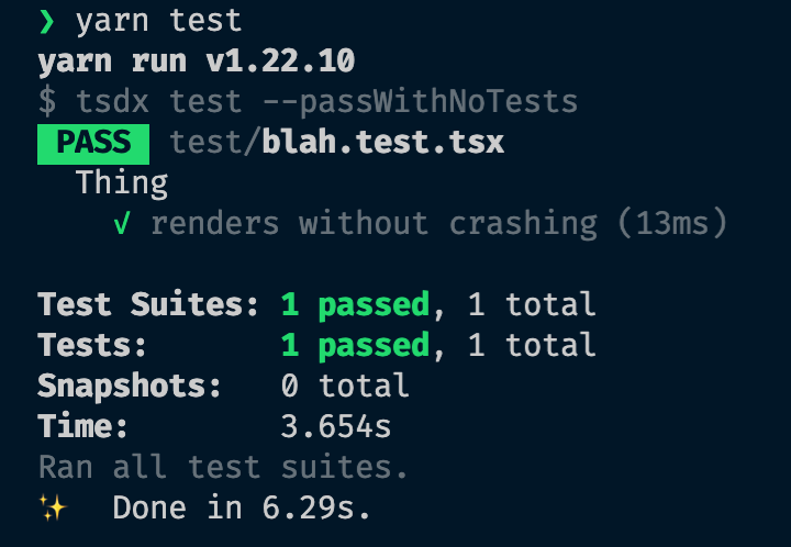
Now, let's see we haven't broken anything and see that our test is functioning by running:
yarn test
And we get this output:
You might be wondering: "What's going on here?"
Well, Jest doesn't know how to read CSS. Also, it doesn't really care about it either, so we will have to mock it for him with identity-obj-proxy (to learn more about why go here). Let's add it:
yarn add -D identity-obj-proxy
Next, we will need to point Jest at the correct type of files by adding this snippet to our package.json file:
// package.json
...
  "jest": {
    "moduleNameMapper": {
      "\\.(jpg|jpeg|png|gif|eot|otf|webp|svg|ttf|woff|woff2|mp4|webm|wav|mp3|m4a|aac|oga)$": "<rootDir>/__mocks__/fileMock.js",
      "\\.(css|less|scss|sass)$": "identity-obj-proxy"
    }
  },
...
Now we can run the test again, and behold the new results:
Adding Styled Components
So now that we have all that going for us, let's see how Styled Components gets in the mix...
First, let's install the package and its TypeScript types:
yarn add -D styled-components @types/styled-components
Now let's keep it simple and start by building a Button component (original, yes I know...):
// src/Button.tsx

import React, { FC } from 'react';
import styled from 'styled-components';

const StyledButton = styled.button`
  background-color: blue;
  color: white;
`;

export interface ButtonProps {
  text: string;
}

export const Button: FC<ButtonProps> = ({ text }) => {
  return <StyledButton>{text}</StyledButton>;
};
I'm assuming basic knowledge in Styled Components. If you are new to it, check out the doc site.
We will need to add it to our index.tsx:
export * from './Thing';
export * from './Button';
Add a Story for it, so we can see it:
// stories/Button.stories.tsx

import React from 'react';
import { Meta, Story } from '@storybook/react';
import { Button, ButtonProps } from '../src';

const meta: Meta = {
  title: 'Button',
  component: Button,
  argTypes: {
    text: {
      control: {
        type: 'text',
      },
    },
  },
  parameters: {
    controls: { expanded: true },
  },
};

export default meta;

const Template: Story<ButtonProps> = (args) => <Button {...args} />;

export const SCButton = Template.bind({});

SCButton.args = { text: 'Button' };
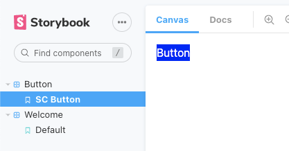
And voila! Our very ugly button:
We can do better of course... Let's remove our styles and add some Tailwind classes:
// src/Button.tsx

import React, { FC } from 'react';
import styled from 'styled-components';

const StyledButton = styled.button``;

export interface ButtonProps {
  text: string;
}

export const Button: FC<ButtonProps> = ({ text }) => {
  return (
    <StyledButton className='px-8 py-2 font-semibold text-white transition duration-500 ease-in-out transform rounded-lg shadow-xl bg-gradient-to-r from-red-300 to-blue-300 hover:from-pink-400 hover:to-indigo-400'>
      {text}
    </StyledButton>
  );
};
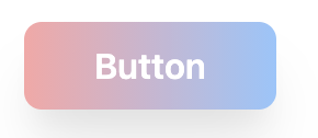
And now we have this handsome fellow:
We still have some styles in our Styled Components, which we don't really need, and our JSX is a bit long and messy. If we combine our classes into our Styled Components, that should clean it up and make our concerns a bit more clear. To achieve this, we will use the [attrs API](styled-components.com/docs/api#attrs) which allows us to attach props to our styled component:
// src/Button.tsx

import React, { FC } from 'react';
import styled from 'styled-components';

const StyledButton = styled.button.attrs(() => ({
  className:
    'px-8 py-2 font-semibold text-white transition duration-500 ease-in-out transform rounded-lg shadow-xl bg-gradient-to-r from-red-300 to-blue-300 hover:from-pink-400 hover:to-indigo-400',
}))``;

export interface ButtonProps {
  text: string;
}

export const Button: FC<ButtonProps> = ({ text }) => {
  return <StyledButton>{text}</StyledButton>;
};
This method allows great flexibility. How so? Say we now want to change the text color by the button "variant". We can do this by adding a prop to our Button, and we can either change it by changing our used Tailwind class name or use the prop and change it via our Styled Component string interpolation.
First, we'll add a variant prop to our component interface, and add 2 possible values:
export interface ButtonProps {
  text: string;
  variant?: 'default' | 'warning';
}
Pass it in:
// we set our "default" variant to... Um, well, to "default" ¯\_(ツ)_/¯

export const Button: FC<ButtonProps> = ({ text, variant = 'default' }) => {
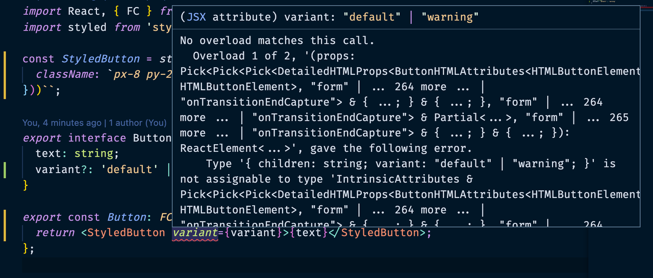
  return <StyledButton variant={variant}>{text}</StyledButton>;
};
Hold on now! we have a TypeScript error!
Notice the squiggly line under "variant"? In a nutshell, TS is telling us "you are passing in a parameter I don't know about". Let's fix that:
// attr function needs the type, but also the "styled" function itself

const StyledButton = styled.button.attrs(
  ({ variant }: { variant: ButtonVariants }) => ({
    className: `px-8 py-2 font-semibold text-white transition duration-500 ease-in-out transform rounded-lg shadow-xl bg-gradient-to-r from-red-300 to-blue-300 hover:from-pink-400 hover:to-indigo-400`,
  })
)<{ variant: ButtonVariants }>``;

// extract the type out from the interface for reuse.

type ButtonVariants = 'default' | 'warning';
export interface ButtonProps {
  text: string;
  variant?: ButtonVariants;
}

// There are a ton of other fancy ways of doing this in TS.
Back to business... So, one way to change our text color using our new variant prop would be just using template literals and choosing a different Tailwind class name for text. The other would be to use that same prop in our Styled Components backticks:
// Option 1️⃣ :
const StyledButton = styled.button.attrs(
  ({ variant }: { variant: ButtonVariants }) => ({
    className: `px-8 py-2 font-semibold ${
      variant === 'default' ? 'text-white' : 'text-red-700'
    } transition duration-500 ease-in-out transform rounded-lg shadow-xl bg-gradient-to-r from-red-300 to-blue-300 hover:from-pink-400 hover:to-indigo-400`,
  })
)<{ variant: ButtonVariants }>``;

// Option 2️⃣ :

const StyledButton = styled.button.attrs(() => ({
  className: `px-8 py-2 font-semibold text-white transition duration-500 ease-in-out transform rounded-lg shadow-xl bg-gradient-to-r from-red-300 to-blue-300 hover:from-pink-400 hover:to-indigo-400`,
}))<{ variant: ButtonVariants }>`
  color: ${({ variant }) => (variant === 'warning' ? 'red' : '')};
`;
The tradeoff with option 2 is not having Tailwinds' utility classes and color themes to help us style things. However, mixing and matching both approaches is mighty powerful if you think about it.
One last thing that can be helpful is using a library like [tailwind-classnames](https://github.com/muhammadsammy/tailwindcss-classnames) which helps validate you are using correct class names, and if you don't TS will yell at you. It has the full capability and API of the known [classnames](https://www.npmjs.com/package/classnames) library, as it is just an extension of it.
Adding React Testing Library
I am not going to start explaining why you should be using React Testing Library, or how it's different from Enzyme. I'll just say that I think It's great and that in my opinion, you should be using it.
With that out of the way... Let's add it to our project by running:
yarn add -D @testing-library/react @testing-library/jest-dom
Next, let's add a test for our Button component:
// test/Button.test.tsx

import * as React from 'react';
import { render } from '@testing-library/react';

// This below import is what gives us the "toBeInTheDocument" method
import '@testing-library/jest-dom/extend-expect';

// As we are using the Component Story Format we can import it from our
// previously written story.
import { SCButton as Button } from '../stories/Button.stories';

describe('Button', () => {
  it('should render the button without crashing', () => {
    // render the button and get the getByRole method
    const { getByRole } = render(<Button text='test' />);

    // getByRole as its name gets a selector by its role.
    // in this case we're looking for a `button`.
    // then we make sure it's in the document
    expect(getByRole('button')).toBeInTheDocument();
  });
});
We also want to make sure that besides rendering, we can click it. So we'll check that as well:
// ... same imports except:
// we've added the fireEvent method to simulate a user click
import { render, fireEvent } from '@testing-library/react';

describe('Button', () => {
  //... our former test
  it('should call the onClick method when a user clicks on the button', () => {
    // mock out our OnClick function
    const mockClick = jest.fn();

    const { getByRole } = render(<Button text='test' onClick={mockClick} />);

    // we store a variable with the button element
    const buttonElement = getByRole('button');

    // Simulate a user clicking on the button
    fireEvent.click(buttonElement);

    expect(mockClick).toHaveBeenCalledTimes(1);
  });
});
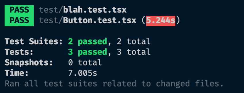
Let's try and make sure the tests work with yarn test.
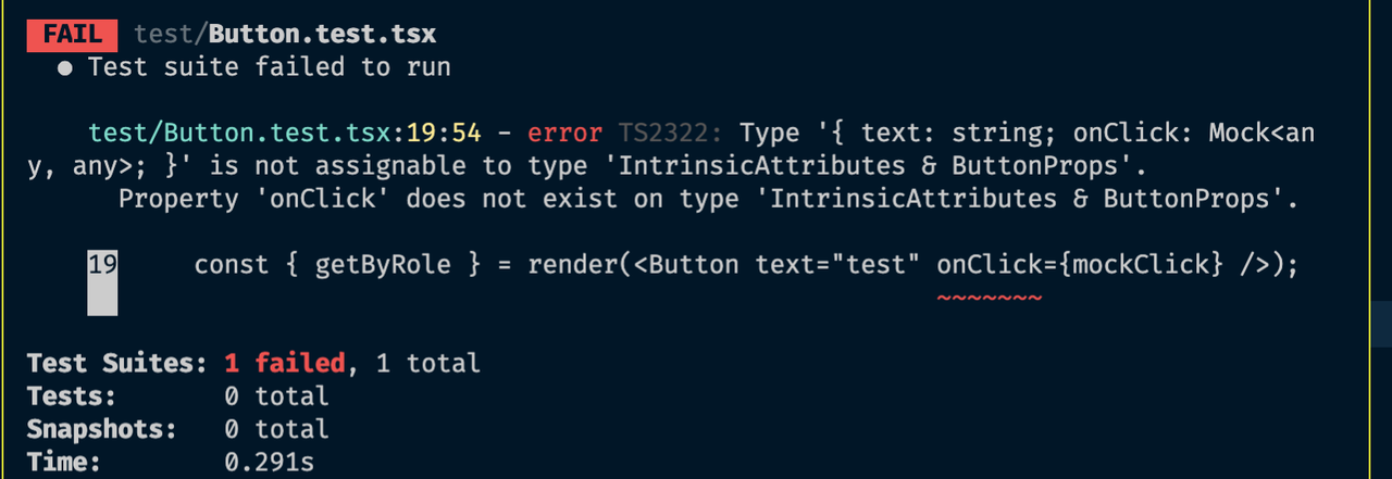
But what's this 😱 ?
The test failed due to a TypeScript error... 🤦🏽♂️
No fear! We can fix it... We'll go back to our Button file:
// src/Button.tsx

// add the relevant type import
import React, { FC, ButtonHTMLAttributes } from 'react';

// ...

// We'll add the relevant missing type by extending our interface:
export interface ButtonProps extends ButtonHTMLAttributes<HTMLButtonElement> {
  text: string;
  variant?: ButtonVariants;
}

// make sure we pass all the rest of the props to our component:

export const Button: FC<ButtonProps> = ({
  text,
  variant = 'default',
  ...rest
}) => {
  return (
    <StyledButton variant={variant} {...rest}>
      {text}
    </StyledButton>
  );
};
And now we are all green!
One more test that is worth demonstrating is for our button with the dynamic Tailwind class. If you recall, we're testing option 2️⃣ :
const StyledButton = styled.button.attrs(
  ({ variant }: { variant: ButtonVariants }) => ({
    className: `px-8 py-2 font-semibold ${
      variant === 'default' ? 'text-white' : 'text-red-700'
    } transition duration-500 ease-in-out transform rounded-lg shadow-xl bg-gradient-to-r from-red-300 to-blue-300 hover:from-pink-400 hover:to-indigo-400`,
  })
)<{ variant: ButtonVariants }>``;
We can easily test that we're expecting to have our text-white class when we're with the default variant and that we have the class text-red-700 for the warning variant. Let's add that test:
it('should have the right text color class name for variants', () => {
  // we extract the "rerender" method to test both variants
  const { getByRole, rerender } = render(<Button text='test' />);

  const buttonElement = getByRole('button', { name: 'test' });

  // if you recall, passing no variant, defaults to "default" variant.
  // this is a bit robust, but it serves to illustarte the point
  expect(buttonElement.classList.contains('text-white')).toBe(true);
  expect(buttonElement.classList.contains('text-red-700')).toBe(false);

  // render the other "warning" variant
  rerender(<Button text={'test'} variant='warning' />);

  // test the opposite of the above:
  expect(buttonElement.classList.contains('text-white')).toBe(false);
  expect(buttonElement.classList.contains('text-red-700')).toBe(true);
});
If you add any dynamic CSS styles with Styled Components use
jest-styled-componentsfor testing.
Sanity Check with TSDX Example
Now that we've tested our newly added component, if we'd like to gain more confidence that our button will work with our outputted and bundled code, we can use the TSDX example repo.
For that, we'll build our code with this command:
yarn build
Then we can move to our example folder and install our dependencies:
cd example && yarn install
Next, we'll import our Button and add it to our example App:
// example/index.tsx

import 'react-app-polyfill/ie11';
import * as React from 'react';
import * as ReactDOM from 'react-dom';
// the importing location is automatically `dist` folder
import { Thing, Button } from '../.';

const App = () => {
  return (
    <div>
      <Thing />
      <Button text="test" />
    </div>
  );
};

ReactDOM.render(<App />, document.getElementById('root'));
We'll boot up the example app with yarn start, then we'll visit http://localhost:1234 and we should see this:
So, there we have our Button under our "snozzberries" component. Looks like it's all working!

Setting up Chromatic
As I've mentioned, Chromatic is the perfect tool to build, test, and collaborate on design systems. To get up and running, you can follow along with their docs, or just go and sign up at the Chromatic site.
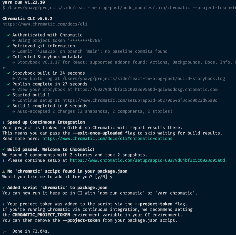
Once you've finished signing up, go ahead to your dashboard and create a project, you can choose an existing GitHub repo to start with. Once the project has been created, you'll need to install the Chromatic package:
yarn add --dev chromatic
Then you can publish your Storybook with the following command:
npx chromatic --project-token=<your_project_token>
This process will also guide you to complete the process and create an npm script for you:
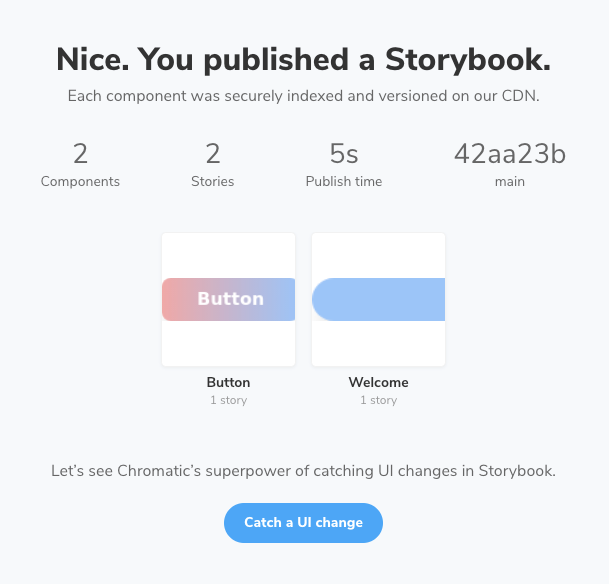
Opening the "continue setup" link we get to this screen:
Now we can test and show how Chromatic works but clicking the "Catch a UI change" button. For that, let's change something in one of our components. Good ol' "Snozzberries" background is a good enough candidate:
// src/Thing.jsx

// ...

// I've changed the bg-blue-300 class to bg-yellow-300 which is the background color:
export const Thing: FC<Props> = ({ children }) => {
  return (
    <div className='flex items-center justify-center w-5/6 m-auto text-2xl text-center text-pink-700 uppercase bg-yellow-400 shadow-xl rounded-3xl'>
      {children || `the snozzberries taste like snozzberries`}
    </div>
  );
};
Once again, let's run the Chromatic script, but now we can use our newly added npm script that has our project token:
yarn chromatic
This time, at the end of the process we'll see a message and an error:
Then going back to the Chromatic website this is what we see:
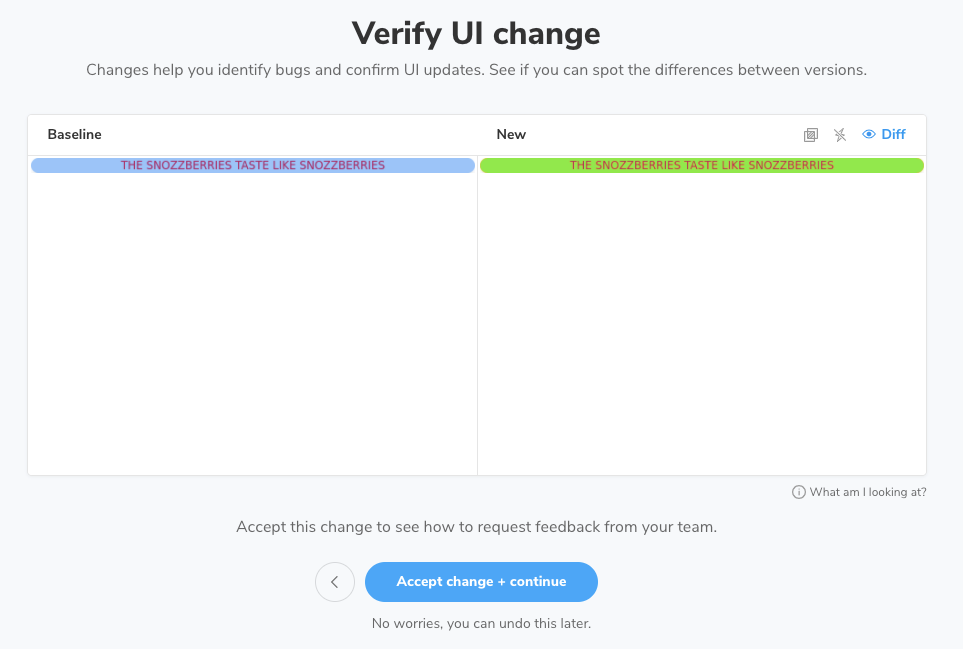
Now click on the "Welcome" component (our "snozzberries" component, that we should have renamed in its story 😬 ), which will lead us to the comparison screen:
On the right, we can see the new "state" of the component highlighted by green. Note, that this isn't the actual color we put, but just "what has changed". The three buttons on the top right can be toggled to show the actual new visual, click on the "Diff" will show us just that:
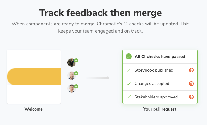
We can click "Accept change + continue", which leads us to more explanations of the feedback process.
Chromatic allows us to create a workflow around building a UI library, where you can collaborate with your developer teammates and designers to streamline better communication. To achieve this, it is highly recommended to integrate this with your CI. In doing so, you can make this part of a PR process: when reviewing code changes, you review the UI changes as well.
Preparing for Production
After we've finished developing, we want to make sure our package is ready to be published and consumed properly. For that, one more handy tool TSDX offers us is its size check script. The default size limit for our package is defined in our package.json under the size-limit property:
// package.json

{
 // ...
  "size-limit": [
    {
      "path": "dist/react-tw-blog-post.cjs.production.min.js",
      "limit": "10 KB"
    },
    {
      "path": "dist/react-tw-blog-post.esm.js",
      "limit": "10 KB"
    }
  ],
 //...
}
To run it we should make sure all of the code is built, and then we can run the size script by executing:
yarn build && yarn size
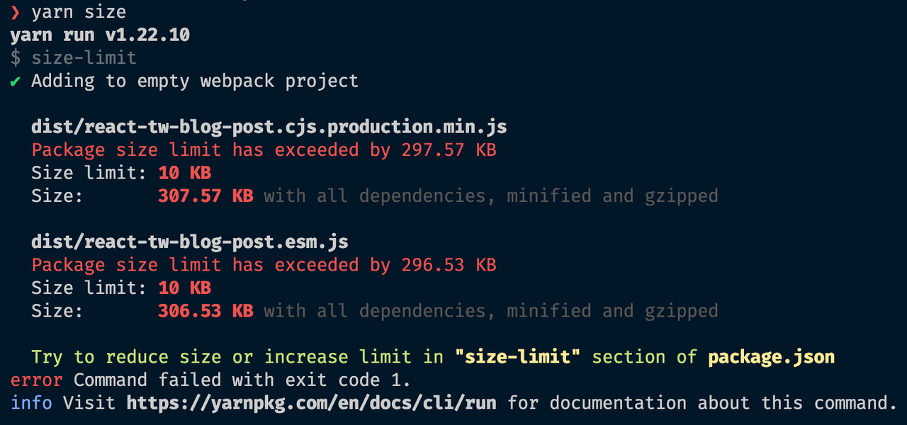
But what's this?
We only have 2 components and the size is over 300KB??? That doesn't seem right.
This is happening, because we missed something in our configuration... To be more exact, we forget about a key config when preparing any project using Tailwind for production - purging our CSS. Without this step, our CSS bundle consists of 294.0KB (Gziped).
Following Tailwinds "Remove unused CSS" section, we can add this configuration to our package:
// tailwind.config.js

module.exports = {
  purge: [
    './src/components/**/*.tsx',

    // This is a convention for files that only include Styled Components.
    // If you don't use this convention feel free to skip it.
    './src/components/**/*.styled.tsx',
  ],
  darkMode: false, // or 'media' or 'class'
  theme: {
    extend: {},
  },
  variants: {
    extend: {},
  },
  plugins: [],
};
Another important note is that for Tailwind to actually run the purging process, it must be run with NODE_ENV that is set to production. So, let's modify our build script:
// package.json

{
  // ...
  scripts: {
    // ..
    build: 'NODE_ENV=production tsdx build';
    // ...
  }
  // ...
}
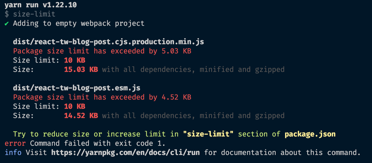
Finally, we can rerun yarn build && yarn size. Now our output will be:
Still not under the TSDX default of 10KB, but much much better. Like the green text in the CLI output says, you can increase your limits as needed.
There are many more things to do to optimize your bundle size output, most of them around how and what you use out of Tailwind. For example, you can disable the preflight setting which will remove all the CSS resets and share off some more KBs.
In the end, you should consolidate and minimize what you use from the default Tailwind configuration. Adjust for your needs, and try to get your designers to choose and minimize the options. You probably don't need [84 colors](tailwindcss.com/docs/customizing-colors) for your project...
Viewing your Tailwind Configuration
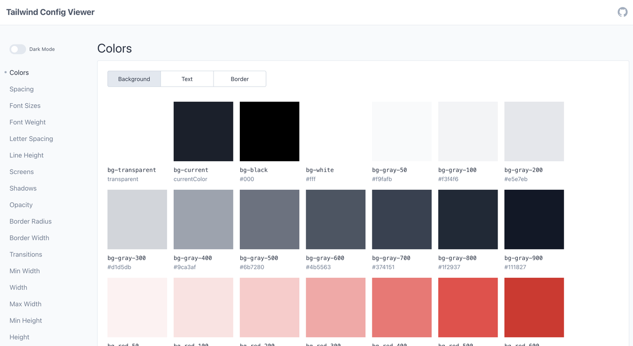
One more nifty tool that can help developers and designers alike working on a project like this is tailwind-config-viewer. As stated on the repo's page:
"A local UI tool for visualizing your Tailwind CSS configuration file."
It helps see what you've chosen as your Tailwind configuration. You can use npx on any project that has a tailwind.config.js file and just see what it has. Just run:
npx tailwind-config-viewer
Besides showcasing your chosen config, you can hover over any class and just copy it with a click of a mouse.
Publishing
In this post I am not going to dive into this subject, it deserves a post of its own. However, with the setup I've mentioned here, publishing to npm or github packages has some more setup and configuration entailed, but not much. The build artifact following these aforementioned steps is ready to be taken and put on any registry.
I plan on doing a follow-up post on how to publish using Github packages + CircleCI / Github Actions + Changesets. Perhaps, I'll even address how to publish to Bit.
This is already a far too long post as it is 😅.
Other Tailwind-in-JS Solutions
I've already mentioned twin.macro, and just recently learned about Compiled CSS in JS, which apparently should work with it as well.
Another very Intriguing project is Twind. Which, I've learned about after tweeting my plans about writing this post. One of the project maintainers, Sascha Tandel, reached out to me and asked me to consider writing a little bit about it as well. I have not had the chance to dig into it too much and try it out, but I did read the docs and it is quite interesting.
Here's what Sascha had to say about it:
"Twind is a no-build-step tailwind-first CSS-in-JS library which allows seamless integration with existing Tailwind HTML using the twind/shim module. This feature can be used together with your favorite framework without any additional setup.
twind/shimdynamically detects used Tailwind classes within the HTML document, creates the corresponding CSS rules, and injects these into a stylesheet. Here is an example to play with. By shipping the compiler (rather than the resultant output) there is a known and fixed cost associated with styling. No matter how many styles you write or how many variants you use, all that your users will ever have to download is approximately 12KB of code (which is less than styled-components or your average purged Tailwind build). On the server, we can use twind/shim/server to generate the initial CSS to be included in the HTML.
Unlike Tailwind, Twind is not limited to the restrictions of a class name strings as input. One pain-point commonly felt when using utility CSS is long and unwieldy lines of code consisting of class names, often denoting styles at various breakpoints, which are quite hard to comprehend. It is not uncommon for a single element to have tens of rules applied to it. Twind provides a grouping syntax to combine common variants or prefixes. Both responsive and pseudo variants are supported in various combinations:bg-red-500 shadow-xs md:(bg-red-700 shadow) lg:(bg-red-800 shadow-xl).
Because Twind is generating CSS during runtime there is no need to restrict the usage of variants. Every variant can be applied to every class. Additionally, variants can be stacked likehover:focus:text-blue-700. The Twind documentation site contains an overview of all extensions.
As a convenient escape hatch for all those one-off styles which aren't supported by Tailwind, Twind allows writing arbitrary CSS making it a full CSS-in-JS solution."
Some more appealing things that came out of our DMs were that the team is working on a [styled module](github.com/tw-in-js/twind/pull/7) and TypeScript support. Also, the package has its own "CSS-in-JS" baked in, so no need for Styled Components, Emotion, or Goober.
Twin has a similar API to twin.macro and granted, it is still in early versions (v0.15.1 at the time of writing), however, it might have a great future ahead of it. I for one, can't wait to try it out! For now, here is a Codesandbox with React to play around with yourself 😃:
{% codesandbox 73pm9 %}
Conclusion
I hope I helped guide you through how to get a project like this going. I know I've enjoyed writing this, and I've learned a lot by doing so. I think the tooling I've mentioned in this post is pretty solid and absolutely helps boost productivity, but I know it's not so easy to set up. That is why I wrote this down, so someone doesn't have to go through the same hassles I did.
Surely, some tweaks and improvements can be made to this approach. Obviously, this is an opinionated way of building something like this. After all, I am one person and I have, like, you know, my opinion, man.
Hopefully (🤞🏽) if you've read this down to here, you've enjoyed this post. If you did, please share this around, comment, like, and push the subscribe button 😜.
Cheers! 🍻
